Inspiration: a functional approach to creative practice.
PhD thesis in Art, Design & Media, by Gil Dekel.
11.2 Movement
The need to express inner purity in art work sees the artists using vivid and transparent colours as a mean to create intense visible movement symbolising the movement of inner purity. Michael Lancaster, in his study Colourscape (1996), suggests a theory that may explain why this movement is carried out through use of colours. Lancaster (1996: 6) explains that colours depend on relationships to the extent that no colour can be seen in isolation. Colours are working in what can be seen as a collaboration, which does not relate necessarily to the object on which they lie. In that way colours are used by artists for their inner relations that create a sense of inner movement within the art work.
Vivid / transparent
Kandinsky explains the inner qualities of vivid colours and the way that they seem to glow. Kandinsky (1972: 61) asserts that each colour can extend through variations between warm and cold, yet red has the most extensive scale. Red, he says, has an inner glow, which creates a movement within itself, not a movement outside and not even inside.
The inner qualities of primary colours are exemplified in the Pointillism technique which applied separate dots of colours on the canvas (end of the 19th century). Matisse’s painting Luxe, Calme et Volupté from 1904 (fig. 64) is an example of the pointillist technique, where vivid colours were created not by mixing, but by painting small dots side by side. The Pointillism technique is important not only for its use of colour but also for its use of colours as the shape. The shape that is required to contain the colour is the shape of the dot itself which is the colour. In that way the pointillist technique has turned colour into the abstract shape, without the need to create another shape for the purpose of dispensing the colour. Kazimir Malevich (Crone & Moos, 1991: 1) reflected in 1908: ‘Until now there was a realism of objects, but not of painted units of colour…’ The Pointillists have managed to demonstrate painting with units of colour. This issue does not seem to be mentioned too often in the academic literature, perhaps because the subject matters of the paintings, as can be seen in the case of Matisse’s work, are representations of objects (figures, trees, landscape) to the effect that we may forget that such representations are created by the familiarities of the viewer’s memory with these images. As it stands to itself, the painting can represents colour and not necessarily images.
[awaiting permission to upload image 64]
Figure 64: Henri Matisse, Luxe, Calme et Volupté (1904, oil.) Paris: Musée National d’Art Moderne.
Since colours are not mixed they retain their individual vividness. Yet, when the viewer looks at the painting from a distance, colours blend to create new hues. This effect of colours blending is used widely today in modern digital printing, such as in outdoor large scale poster prints.
While Matisse has managed to create shape through the physical property of dots of colours, using several colours, modern artists tend to pick or focus on a single colour only, and use it as the main source for their work. I see modern art works as if they have been zooming into such works as Matisse’s, and focusing only on one element or colour. Artist Felice Varini tends to apply a single colour, mainly blue or red, painting on urban landscapes. In that way the colour’s hue is altered as the result of the hue of the surface on which it is applied (fig. 65), and new hues are created through the hue of the urban’s ‘…surface and the light conditions’ (![]()
![]() para. 19). While Matisse’s intense colour would blend with colours beside it, from ‘side to side’ so to speak, Felice’s colour blends with colours behind it (surface) and in front of it (sun). This illustrates Felice’s ambition to break away from the flatness of the canvass, as he explains (
para. 19). While Matisse’s intense colour would blend with colours beside it, from ‘side to side’ so to speak, Felice’s colour blends with colours behind it (surface) and in front of it (sun). This illustrates Felice’s ambition to break away from the flatness of the canvass, as he explains (![]()
![]() para. 18), and to allow for a three-dimensional blending, where the intensity of the colour becomes a merging point between the sky and the earth. It is in this form that art has reached a point in history where colour does not represent an object, but is the culmination of it.
para. 18), and to allow for a three-dimensional blending, where the intensity of the colour becomes a merging point between the sky and the earth. It is in this form that art has reached a point in history where colour does not represent an object, but is the culmination of it.
The inner purity of white receives an intense movement through intense colours, having an inner glow, as Kandinsky asserted – a side to side glow, in Pointillism, as well as an up and down or front and behind, seen in Felice’s works (fig. 65).
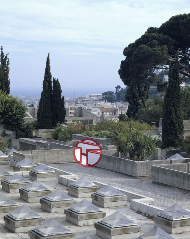
Figure 65: Felice Varini, Terrace No. 2 (1988, Acrylic paint on urban landscape.) Villa Arson, Nice, France. Image © the artist. Permission to use image obtained from the artist.
Kapoor goes further, trying to generate a movement of his inner ideas to the work by trying to penetrate into the colour. Like Felice, Kapoor uses monochromatic colours, usually red, but treats the pigment of the colour itself as the surface of the works, as can be seen in the example of his pigment sculptures (fig. 66). The sculptures are made of red pigment which acts as the surface for pigment, the red colour. In that way colour does not sit on a surface but rather on colour, on itself. The next step in the history of art might well be a work of colour that does not stand on material at all – a non-material essence that reflects colour.
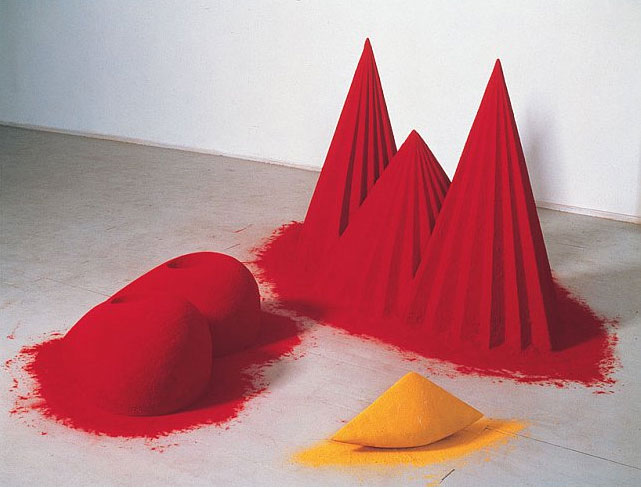
Figure 66: Anish Kapoor, As If To Celebrate I Discovered a Mountain Red Flowers (1981, Mixed media: wood, cement, polystyrene, pigment, 107 x 305 x 305 cm overall.) Collection: Tate. Image © Anish Kapoor. Image supplied by Anish Kapoor Studio. Permission to use image obtained from Anish Kapoor Studio via Lisson Gallery.
It seems to me that the use of intense colours by artists comes to illustrate their desire to look into colour, and to show that colour should not be treated as a mere rendering tool for surface, but rather as a vehicle for a spiritual essence. Kapoor (2005) explains that he sees colour not as a surface but as a form, or, as Gabo (Annely Juda Fine Art, 2003) said long before him, ‘Colour is the flesh of our visual perception of the world, not its skin’.
Likewise, I have experimented with transferring inner ideas, or moving ideas from my mind and to the audiences, and with use of intense colour in the film Unfolding Hearts (2006; ![]() ). The intensity of the images I created was achieved through inverting pictures of flowers that I had taken (fig. 67). The film deals with an artistic experience of seeing the world in brighter, vivid colours which contained a spiritual message. The script reads:
). The intensity of the images I created was achieved through inverting pictures of flowers that I had taken (fig. 67). The film deals with an artistic experience of seeing the world in brighter, vivid colours which contained a spiritual message. The script reads:
‘As I was walking [down] the street, suddenly I felt light in me and around me, as if someone pushed me from above the water from deep within…’ (minute 0.28), ‘I’ve looked around me, the sky, houses, trees, people – everything was alive, but different. All was made of sparkles of light, blinking…’ (minute 1.35).
The inversion of the images is as an attempt to invert reality, trying to bring out some qualities that are inherent within things, and which our eyes cannot see in daily life. The use of intense colours attempted to make that shift an intense one. As one feedback (![]() ) on the film noted, ‘the colours [are]… the seven magic colours in Chakras’. The seven Chakras are symbolic wheels where the spiritual and physical meet, denoted by seven intense colours, each representing a specific quality in the person (fig. 68).
) on the film noted, ‘the colours [are]… the seven magic colours in Chakras’. The seven Chakras are symbolic wheels where the spiritual and physical meet, denoted by seven intense colours, each representing a specific quality in the person (fig. 68).
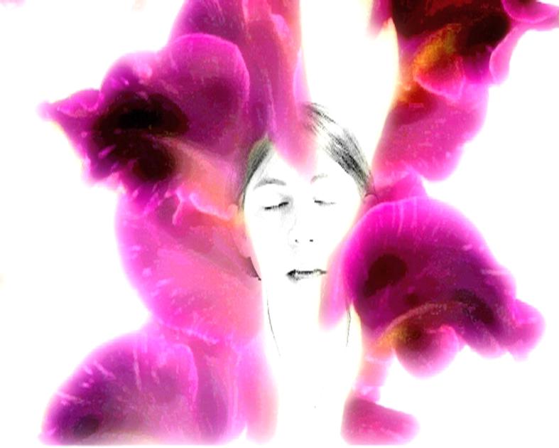
Figure 67: Still image from the film Unfolding Hearts (2006). Image © Gil Dekel.
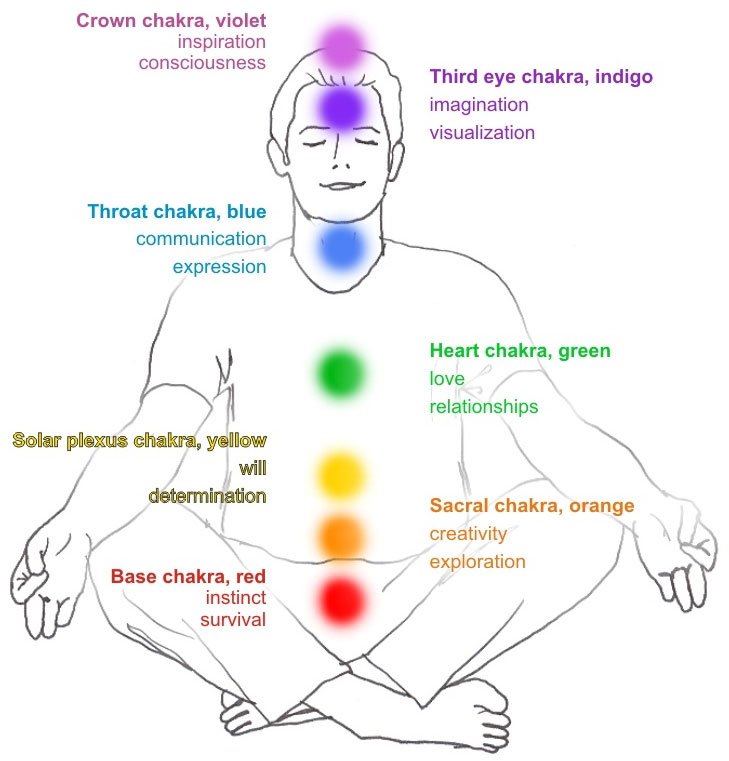
Figure 68: The seven Chakras. Image © Gil Dekel.
Gilbert & George shed new light on the way that intense colour can deliver inner ideas. They (Bickers & Wilson, 2007: 323) assert that the colours that they use originate from themselves, from their own essence, and not from the outside reality:
‘We started with ourselves, not with copying artistic trends that are seen in museums. It took us years to find red colour, whereas artists start with all colours on their palette, first thing. It took another three years to find yellow.’
I infer from this that the intense colours used in their works come from knowing themselves, not from using colours that were the ‘trend’ in the cultural scene. Vivid red, yellow and blue are the extensions of the artists themselves, and to evidence this they tend to use their own image as a signature that renders the colours in their works (fig. 69).
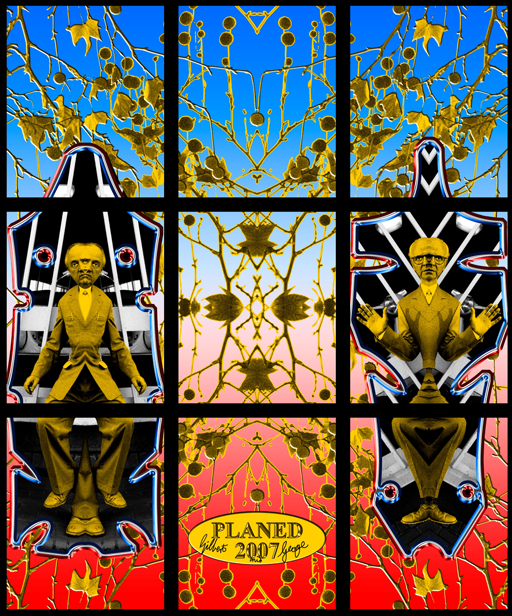
Figure 69: Gilbert & George, Planed (2007, electronic image). Work released to the public domain by the artists through the BBC and Guardian websites, May 2007.
The specific work of Gilbert & George chosen here (fig. 69) was released by the artists over the internet to the public domain as a free gift, just after the showing of a BBC documentary on the artists (May 2007). Doing so, Gilbert & George managed to extend the intensity of the colours in this work – beginning in themselves, moving through their cameras, computers, the BBC TV documentary, the internet – and ending in many forms on the computers of downloaders, who might continue to distribute the light by printing it.
Vivid colours are noted for their force of moving with intensity from what artists describe as spiritual realms and into the physical reality. However, the same quality of movement can be reversed by use of transparent colours. Transparent colours are noted for their translucent quality that allows one to see through the layers. Unlike intense colours that assert a definite artistic statement, the fluidity of transparent colours suggests a sense of blending of several emotional levels that artists express.
By using transparent colours artists observe the process in which things change from one thing to another, or blend one into the other. Watercolour painter Chan (![]()
![]() para. 7) explains, ‘I pay particular attention to the way in which the light falls and how this changes the colours that can be seen. The colours of flowers can be vibrant, intense or delicate’. Chan has an interest in the transition of colours and emotions, which she tries to capture through the transitory quality of watercolours (fig. 70).
para. 7) explains, ‘I pay particular attention to the way in which the light falls and how this changes the colours that can be seen. The colours of flowers can be vibrant, intense or delicate’. Chan has an interest in the transition of colours and emotions, which she tries to capture through the transitory quality of watercolours (fig. 70).
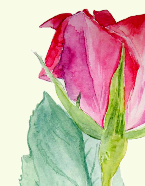
Figure 70: Melanie Chan, Rose 2 (detail) (2007, watercolours on paper, 21 x 42cm.) Image © the artist. Permission to use image obtained from the artist.
The transitory quality of colours can challenge the assumption that an image is observable through separation of its colours. According this assumption when the mind sees different colours it can compare the differences, thus seeing objects more clearly. In that view, if all colours were to blend they would then produce pure black or pure white or grey, as illustrated in fig. 71.
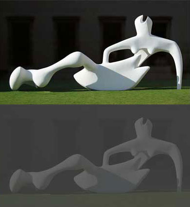
Figure 71: High contrast image (top) and low contrast (bottom) (showing Henri Moore’s Reclining Figure (1951). Photograph © Andrew Dunn. Photo released to public domain by the photographer.)
Yet, the tendency of watercolours to disperse into the paper and produce layers of colours seems to embrace different colours, not separate them. The layering of colours manages to produce a noticeable image, with the viewer’s eye piercing through layers, receiving different levels of the blending quality.
Likewise, Gabo (Annely Juda Fine Art, 2003: [3]) accepts the quality that allows for depths in colour, but he rejects the surface of colour that reflects light. His view is interesting in that it tells us that colours may have a quality in which they withdrawn inside, from the surface of the painting and to inside. In that way, the quality of watercolours to move from the surface through layers, and into the canvas, is challenged by Gabo, who asserts that colour does not ‘begin’ on its surface. Rather, colour ‘begins’ from what I could only suggest to describe as ‘the other side of the colour’. Gabo suggests to look from within colour and deeper forwards, or inwards into the colour. Looking beyond the surface, according to Gabo (Annely Juda Fine Art, 2003: [7]) is like looking into our own psychological selves.
I have been inspired by the idea of looking beyond the surface and into our own psychological selves, and created an art exhibition held in early 2007. I have used printed words as a symbol of thoughts, where thoughts can be seen as representing one’s psychological self. Words were printed on translucent stripes of paper, and hung from the ceiling. The audience was invited to stand behind the stripes, observing the reverse of the words, the ‘other’ sides of words. Observing words from behind, this work asked, where do words come from and where do they stay in one’s mind, from behind the mind, or in front of the mind? (fig. 72-73).
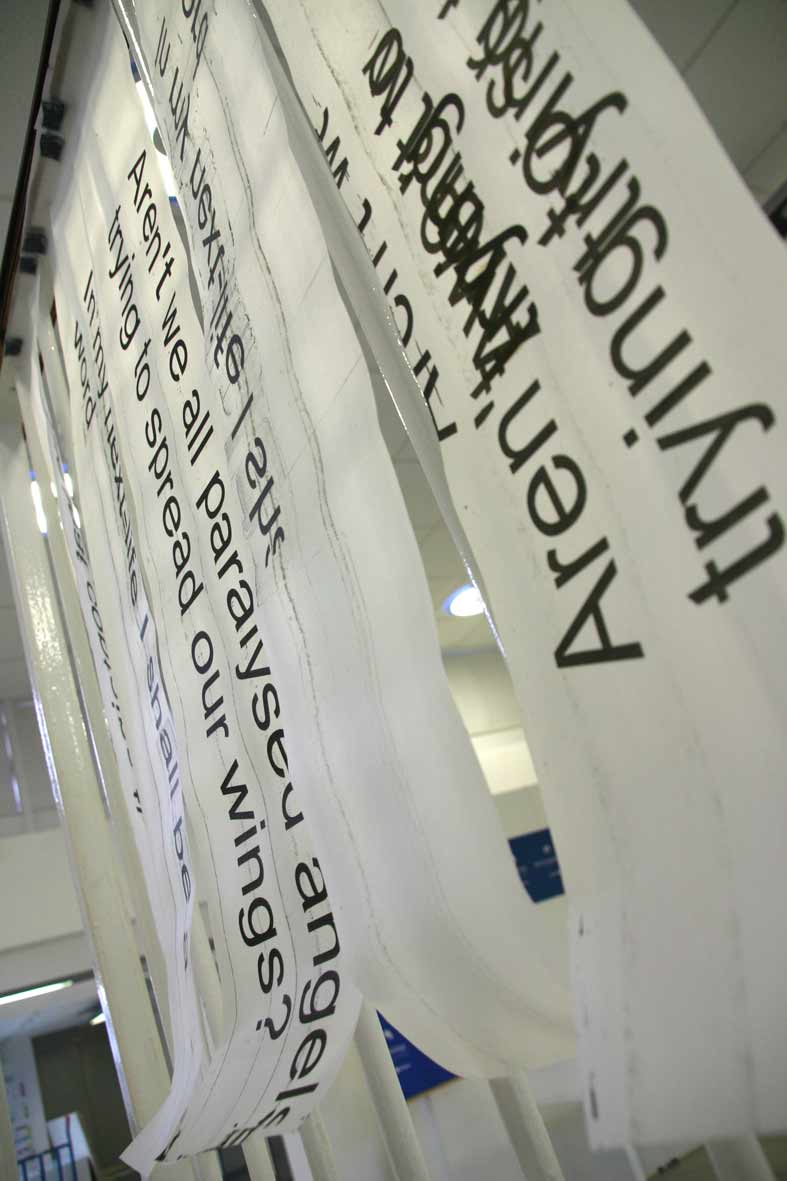
Figure 72: The Other Side of Words (2007, print on transparent stripes). Image © Gil Dekel.
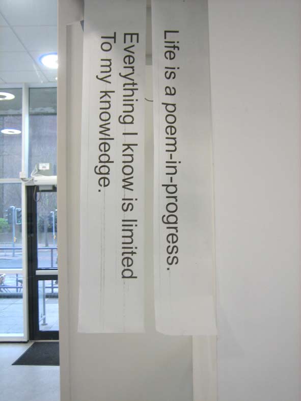
Figure 73: The Other Side of Words (2007, print on transparent stripes). Image © Gil Dekel.
With Gabo’s insistence that colour is an event in itself, not connected to the essence of the object on which it is laid (Annely Juda Fine Art, 2003: [3-4]), we should examine how he treats the transparent quality in his works. Feeling that space is not around us but within us, Gabo uses glass and plastics which allow one to look inside, through it, and get a feeling of a space inside the image that is created (fig. 74). According to Gabo, all people are transparent (Bickers & Wilson, 2007: 38), yet it should be noted that the use of glass and plastics was not merely done for its transparent qualities, but also as a statement of embracing modernity. Gabo believed that art should embrace new materials that technology in the early 20th century had to offer, especially the improved transparent plastics (Lodder, 2007). In that way I suggest Gabo went beyond the dogmatic definitions of what an artist is and what materials he or she should use.
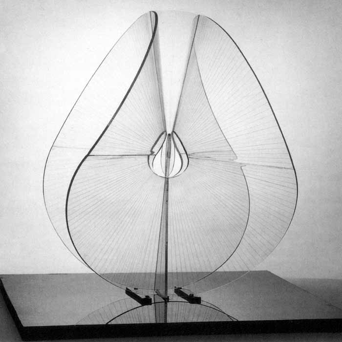
Figure 74: Naum Gabo, Spheric Theme: Translucent Variation (c.1937, this version executed 1951, perspex, diameter 57.3 cm.) New York, Solomon R. Guggenheim Museum. Image source: www.tate.org.uk. Image © Tate. Permission to use image obtained from Tate’s Picture Library Executive (Amelia Morgan).
Katayoun’s work offers a new way of looking at inner spaces and the way that inner ideas are transferred in works of art. In her works she captures direct light, without the use of a camera, straight onto transparent surfaces of glass, using the 19th century Carbon Photography process. By capturing direct sunlight onto glass, the work (fig. 75) suggests that nature itself is the art work, spanning from the sun and to the glass on the earth. In that respect, we are standing within the sphere of her work – between heaven and earth, so to speak, looking at the nucleus core of the work from within it. While Gabo uses transparency as a way of looking from outside into the art work, Katayoun’s uses transparency as a way to allow us to look at the work from within the work.
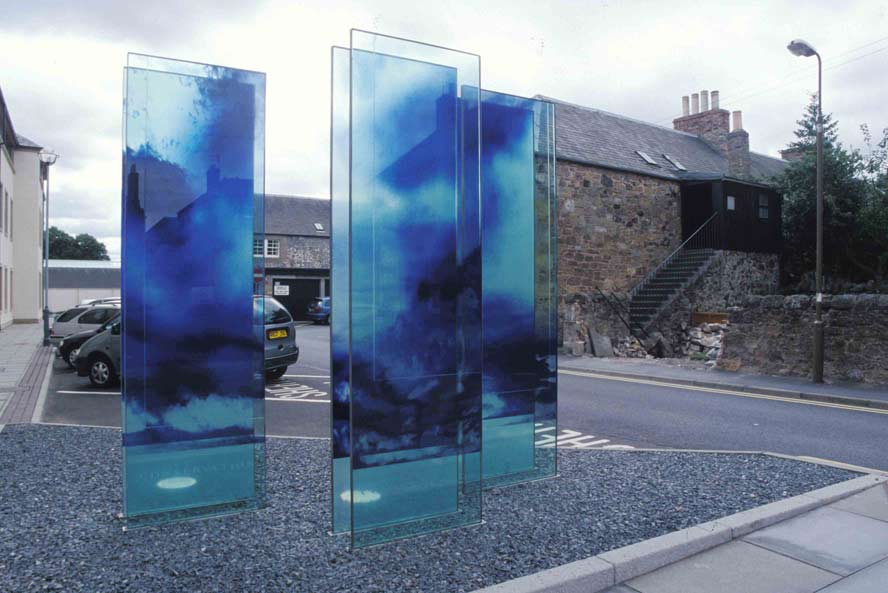
Figure 75: Katayoun Dowlatshahi, Drawing Fragments of Light I, II & III (2004, triptych, gelatine, blue & black pigment onto glass, 168 x 76 cm each.) Image © the artist. Permission to use image obtained from the artist.
Felice’s intense colours suggest a merging point of sun and earth, and Katayoun’s work suggests the same merger yet not by using intense colours but rather transparent colours.
Through the use of the motif of transparency, I see Katayoun’s work as expanding the sphere in which art and people exist. Looking at her work, we are looking at ourselves, and from within ourselves. Katayoun (![]() para. 5) asserts, ‘Light is around us all the time. We live within it…’ She (para. 6) adds that through the process of her works, she ‘discovered invisible characteristics of light…’ In that respect, the motif of transparency turns into a complete invisibility, and this complete invisibility becomes an accomplishment of Gabo’s search for no representation of colour in art.
para. 5) asserts, ‘Light is around us all the time. We live within it…’ She (para. 6) adds that through the process of her works, she ‘discovered invisible characteristics of light…’ In that respect, the motif of transparency turns into a complete invisibility, and this complete invisibility becomes an accomplishment of Gabo’s search for no representation of colour in art.
Yet, one could say that transparency may not be the sublime form of non-representation of colour in art, but simply a form that the human eye cannot register. We could ask what could be the qualities of art works in which colour is not representative and yet is still visible. It could be said that such forms of colour already exists, but it takes new ways of comprehension and having ‘new eyes’ as Proust (‘Marcel Proust’, 2008) suggested, to be able to see it: ‘The real voyage of discovery consists not in seeking new landscapes but in having new eyes’.
But this ‘voyage of discovery’ is a voyage of creating, as theories in Quantum Physics suggest. According to Arntz, Chasse & Vicente (2004: minutes 8.50–14.40) matter can be created through wave length or sphere. Matter is an idea turning into form through shapes and colours.
I consider that colours are seen by artists as having an independent quality which is separated from the surface on which they are applied. As such, colours act as a vehicle for creating movement of inner ideas in the mind of the artists to be externalised in art works. To illustrate this quality, vivid colours and transparent colours are used for their moving quality, allowing the bringing out of things from the inner or spiritual realm as well as the peering through and looking into the spiritual realm.