Inspiration: a functional approach to creative practice.
PhD thesis in Art, Design & Media, by Gil Dekel.
11.1 Shape
The artistic experiences that I examined are manifested from the inner reality and to the external environment through shapes and colours.
Kandinsky, in his study Point And Line To Plane (1979) explains that abstract forms are isolated from their objective environment of material and plane (p. 21). This isolation means that the abstract form frees itself, as Kandinsky (p. 28) asserts, from dependency or practical use, beginning ‘its life as an independent being’. Kandinsky’s assertion indicates an inner quality that the artist observes in the abstract shapes.
Artist and architect Victor Pasmore (Bickers & Wilson, 2007: 352) explains that shapes are not only representative but inherent in the way that people observe reality. Shapes that are observed in nature, such as the circle or the square, do not just exist in nature, but rather they represent some basic form of a visual sensation within people, Pasmore explains. These visual sensations are explored by artists through abstract forms that are not representative but rather stand as an expression of the language of forms themselves.
Abstract / Light / White
Bolt (2004: 11) asserts the importance of abstract forms, indicating the misleading prevailing assumption by art theorists and historians that still seem to assume that visual art is representational. Digital artist Renata Spiazzi (Nalven, 2005: 155) adds, ‘Too often, people looking at a painting get sidetracked by the subject and never get to the real beauty of the work’. Abstraction, according to Spiazzi, allows one to focus on the beauty of the medium itself.
The use of abstract shapes in works of art allows artists freedom and flexibility to remain adaptive to changing inner ideas and emotions, which resonates with the unfixed forms of the shapes. Abstract forms maintain a dialogue with the emotions, continuing to evolve and to be clarified as the artist clarifies his or her own ideas. Abstract forms help the artist to discover his or her own inspired-inner-self, as it may be called, without the need for expertise or technical perfection. The artist may well be proficient in the skill of art making, as Picasso has demonstrated from a very early age, yet the skill is not seen as a necessary criteria for the expression in abstract art. I feel this can be demonstrated in the works of the Supermatist Malevich.
In his attempt to express a universally shared feeling, Malevich (Drutt, 2003) asserted that pure geometrical forms have no specific cultural element to them and as such they can be universally comprehended regardless of cultural or ethnic origin. A simple black square, Malevich asserts, represented economy, which he saw as the most important motif or quality through which to examine reality (Drutt, 2003: 33) (fig. 52).
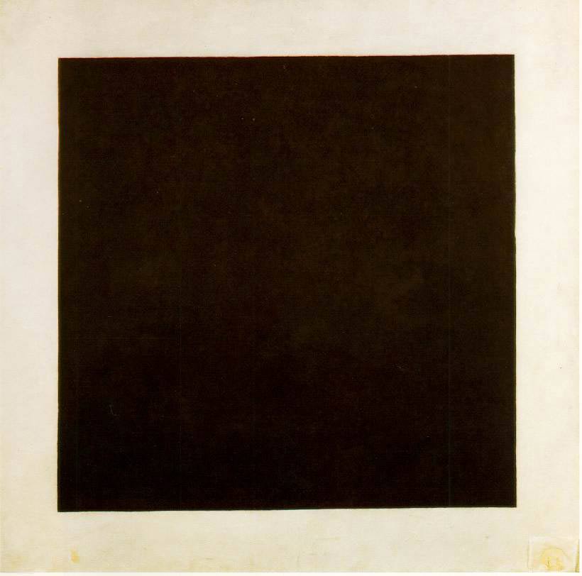
Figure 52: Kazimir Malevich, Black Square (1923, oil on Canvas.) St. Petersburg, State Russian Museum. Image in public domain.
The search for an abstract and a non-objective in his works, was seen by Malevich (Drutt, 2003: 61) as ‘the optimism of a nonobjectivist’. This optimism is well discussed by Gabo through his own abstract construction works, yet he sees it from a different perspective. While Malevich was reaching to reduce art to zero and then go beyond the zero (Drutt, 2003: 46), Gabo was looking for abstract art that retains the laws of nature (Bickers & Wilson, 2007: 37). Gabo’s use of abstract forms was not meant to reach for anti-art, a negation of form, but rather to explore forms and space without depicting mass. He (Bickers & Wilson, 2007: 35) asserts, ‘my art is optimistic, because it looks forward and has a vision’. I draw from this that the symbolic image of ‘looking forward’ is adequate to Gabo’s idea of abstract spaces with no mass, where no specific image is defined but rather multiple possibilities exist for one to look at.
In that same spirit I have attempted to capture the space of artistic possibilities that contains no mass, in my work A Black Circle That is Going To Be (2008) (fig. 53).
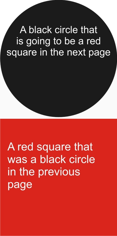
Figure 53: A Black Circle That is Going To Be (2008, electronic Flash animation on www.poeticmind.co.uk). Image © Gil Dekel.
The work was created as an online Flash animation, where the viewer first sees the black circle with its text message of ‘going to be a red square in the next page,’ and after five seconds the circle disappears and the red square appears, with its text message asserting it is ‘a red square that was a black circle in the previous page’. The work is accompanied with this assertion:
‘What interests me is not the square or the circle, but what is in between the two: the artistic process by which one becomes the other.’
In this work I have attempted to bind the abstract space of the creative process between two covers, like a book bound inside covers – the black circle as a front cover, and a red square as its back cover. By linking the two parts I attempted to link the idea of what is going to be created with the actual artwork. This work represents the ‘covers’ of a creative process, which hold the empty space in which creativity occurs. Yet, the creative space between the covers exists only thanks to the text on the images, which asserts this space. The text is read by the viewer, and in that respect the viewer creates that abstract space in his or her mind. The work serves as a frame for a creative process that occurs in the mind of the viewer.
Painter Felice Varini also uses the observation of the viewer as part of constructing his works. In his works he paints geometrical shapes on urban landscapes, using the perspective-localised method in which the complete shape of the work is noticed only from one focal point (fig. 54). Looking from outside the vantage point, the viewer sees fragments, the broken shapes (see two examples in fig. 55).
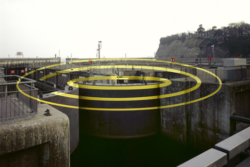
Figure 54: Felice Varini, Three Ellipses For Three Locks (2007, acrylic paint, seen from the vantage point). Image © the artist. Permission to use obtained from the artist.
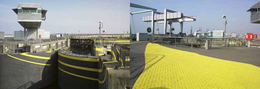
Figure 55: Felice Varini, Three Ellipses For Three Locks (two views) (2007, acrylic paint, seen from outside the vantage point). Image © the artist. Permission to use obtained from the artist.
Unlike my work where the work enters the mind of the viewer, in Felice’s work the viewer walks around the painting, trying to construct an image from different points. Elements in the work are observed through the process of viewers walking around it. Felice (![]()
![]() para. 12) explains:
para. 12) explains:
‘My concern is what happens outside the vantage point of view. Where is the painting then? Where is the painter? The painter is obviously out of the work, and so the painting is alone and totally abstract, made of many shapes. The painting exists as a whole, with its complete shape as well as the fragments.’
In that respect Felice has brought the artistic search for abstract shapes from the invisible and non-existence back to the physical reality. The physical reality serves as the element, or the surface, that produces abstract shapes, in what Felice (![]()
![]() para. 31) suggests is a step forward in the history of abstract art:
para. 31) suggests is a step forward in the history of abstract art:
‘The question that I am asking as an artist is, ‘What is the next step in the history of art after Mondrian, Malevich and Pollock? What can we offer today that will take us to the next step in abstract painting?’ My answer is to work on the three-dimensional reality…’
Installation artist David Johnson seems to take abstract art further by trying to create an experience in which abstract forms are created, and then removed, in what can be termed ‘the abstraction of abstract art’. In The Invention of Nothingness (2008, work in progress) he painted a black abstract form on a wall which covers the shades of the light which is cast on that wall from a floodlight. Once the floodlight is turned off, the viewer can see the abstract black form on the wall (fig. 56).
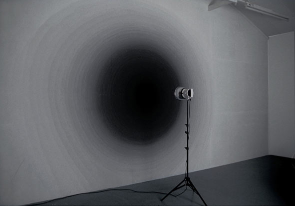
Figure 56: David Johnson, The Invention of Nothingness (2008, work in progress, floodlight off, emulsion paint.) Image © the artist. Permission to use image obtained from the artist.
But once the floodlight is turned on, the light with its brightness covers the black form, so that the viewer sees a uniform wall hue (fig. 57).
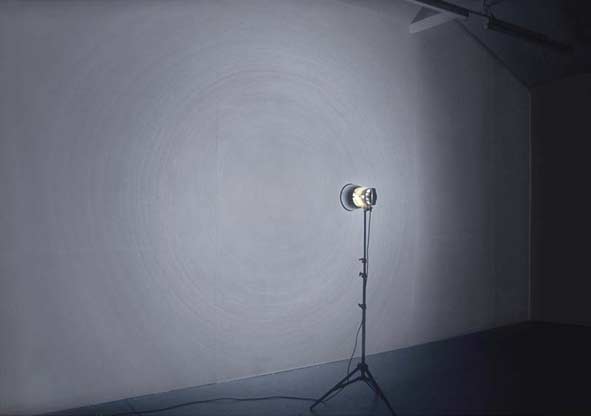
Figure 57: David Johnson, The Invention of Nothingness (2008, work in progress, floodlight on, emulsion paint.) Image © the artist. Permission to use image obtained from the artist.
In that way, Johnson has turned the qualities of abstract shapes upside down or inside out. Abstract forms are not created by light, but rather are negated by light. Johnson has demonstrated an attempt to create abstract forms by ‘flushing’ or rendering images with light.
While Johnson uses light to create a negation of shapes, artist Katayoun Dowlatshahi captures light directly onto glass surfaces, hence using light as the brush (fig. 58). She (![]()
![]() para. 7) explains:
para. 7) explains:
‘…the light source can be represented as a mirror; by shattering that mirror many individual fragments or shards are created. You and I and all other beings are represented by these individual fragments. However, we reflect that one light source from many different perspectives; that is what makes us all unique.’
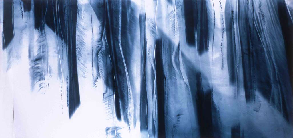
Figure 58: Katayoun Dowlatshahi, Drawing Fragments of Light I, II & III (2004, triptych, gelatine, blue & black pigment onto glass, 168 x76 cm each.) Image © the artist. Permission to use image obtained from the artist.
The use of light and light colours is not new. Following Kirchner’s advice that colours’ ‘birth’ is from light and their combination makes white (Grisebach, 1999: 185), artists have been attempting to remove the sense of ‘shapeness’ of forms by ‘flooding’ them with bright colours, usually with white. Malevich’s White on White from 1917 is an example (fig. 59). However, I observe that rendering shapes with bright colour is not meant only for the purpose of abstraction or negation of image, but also for the purpose of creating a sense of expansion. Ambrose & Harris (2005: 142) explain that rendering a shape with bright colours will give the impression that the shape is larger than a similar shape rendered with dark colours. Light colours have the property to produce an impression of expansion. Malevich is known for his use of white colours for representation of aesthetics that will lead to what he sees as a spiritual freedom. White colour, with its quality of expansion, carries an essence of infinity and higher feelings in his works (Lowry, 2004: 85).
Figure 59: Kazimir Malevich, Suprematist Composition: White on White (1918, oil on canvas, 79.4 x 79.4 cm.) New York, Museum of Modern Art. Image in public domain.
I consider Malevich’s attempt to convey the pure, or the spiritual as he sees it, as unique in that he produced a white colour layer applied on another white colour layer. However, we must admit that Malevich’s work is hung on the gallery’s wall, and in that respect the work, with its light hue, can be seen only thanks to the different hues of the gallery’s wall, which might even be dark.
This problem of light colours is well expressed in the work of Roi Vaara. In 1983 Vaara painted himself with white paint and walked down the streets of Helsinki (fig. 60). Vaara (![]()
![]() para. 14) says, ‘The idea came to me from the notion of the white race, and so I tried to disappear in the landscape’. Yet, looking at the photo documenting this work (fig. 60), I would suggest that Vaara did not manage to disappear in the landscape at all, but on the contrary, became very noticeable against the many other ‘hues’ around him.
para. 14) says, ‘The idea came to me from the notion of the white race, and so I tried to disappear in the landscape’. Yet, looking at the photo documenting this work (fig. 60), I would suggest that Vaara did not manage to disappear in the landscape at all, but on the contrary, became very noticeable against the many other ‘hues’ around him.
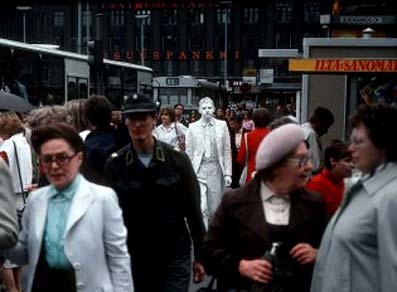
Figure 60: Roi Vaara, White Man (1983, street action) Helsinki, Finland. Photo: © Harri Larjosto. Image obtained from Roi Vaara. Permission to use image obtained from Roi Vaara.
et, this may not be seen as an artistic ‘problem’ to the extent that artists argue that they seek to bring something into this world, not to ‘depart’ from this world to the spiritual realm. In that regard, white colour, which shines bright amidst darker hues, can be seen as a way of bringing spiritual qualities to our reality. To use an old analogy – to shine the light colour against the darker ones. The need of a dark hue for the white to be visible is notable in another Vaara work, his Wet Paint Handshakes (2008; fig. 61). In this work Vaara tries to transfer the qualities of the white hue to the audience who shake his hand which had been dipped in white colour, and yet Vaara (![]()
![]() para. 10) admits to the need for a dark background:
para. 10) admits to the need for a dark background:
‘I wear black tuxedo… and the contrast between the black and white makes the performance visually prominent. After each handshake I wipe the white paint off my hands on my black tuxedo, so the tuxedo becomes ‘dirty’ with white.’
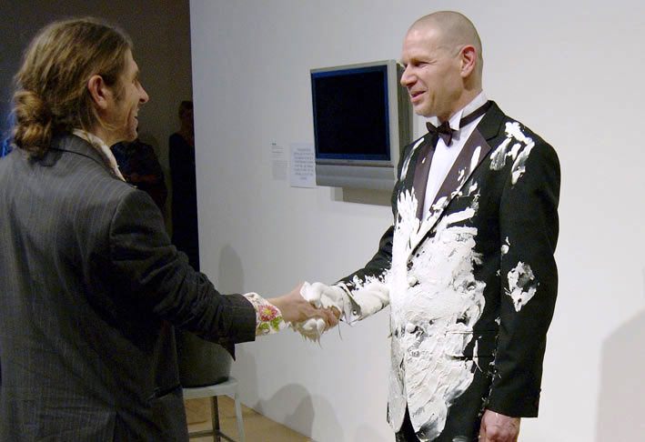
Figure 61: Roi Vaara (right), Wet Paint Handshakes (2008, performance in Hayward Gallery, London, black tuxedo, white paint). Photo: © Naranja. Image obtained from Roi Vaara. Permission to use image obtained from Roi Vaara.
It is interesting that the artist feels a need to use two opposing hues that contradict each other, and yet complement and support one another and create something new, for example, a new view on dirt, as Vaara explains: the tuxedo becomes dirty, yet ‘dirty’ with white. The purity of white is brought down, so to speak, even into dirt. White colour with its purity is used by the artist as a symbol that purifies the physical world.
I see the works of Piet Mondrian as a way forward with the use of light colours. I consider his work as an attempt to express qualities of white not by layering white against other colours, but rather by layering other colours against white. Basic colours of red, yellow and blue are layered within black grid bars against white, as can be seen in the work Composition 10 (1939-1942) (fig. 62).
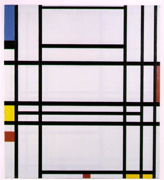
Figure 62: Piet Mondrian, Composition 10 (1939-1942). Private collection (Lauder Collection, New York). Image © 2013 Mondrian/ Holtzman Trust c/o HCR International USA. Image and permission to use obtained from Mondrian/ Holtzman Trust c/o HCR International USA.
In my view the colours and the black grid stand as representation of the physical reality, through which we can peer at the white behind. The peering at the spiritual through the physical in the works of Mondrian does not consist of looking through glasses or a telescope, so to speak, but rather looking through a microscope. Mondrian’s work seems to me as if one looks at a blood cell through a microscope, where patters of physical cells are abstracted into geometrical shapes. The white that is revealed is the spiritual within the blood of people, within us. Mondrian’s own arguments can support my view. Mondrian (Mondrian, Holtzman, & James, 1993: 14) explains that the more basic a colour is, the more inwards and pure its expression. In that respect white shows us the purity which is inside of us, and not necessarily external to us. It can also be viewed as a simple grid, or formula, through which we can connect to our own inner creativity.
Likewise, I have attempted to externalise the inner feeling of purity through poems written and performed as part of an art event in Southampton (August 2007). A video camera was filming the event, yet it stood on a tripod in a bad position, resulting in low-quality footage. When I decided to make a film of the footage, I realised that I would need to create many visuals to replace parts of the footage, and decided on creating visuals consisting of white space into which graphic words will appear. The words are the text of the poems, and they appear one after the other in synchronicity with the spoken words of the poems, resulting in an independent composition of an image (fig. 63).
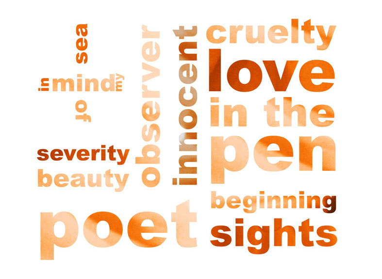
Figure 63: Still image from the film Explorers of the Heart (2007). Image © Gil Dekel.
While Mondrian’s work can be seen as an attempt to look into the inner essence of people, the white DNA so to speak, my work attempts to bring out the messages from within that DNA, to externalise the words that are within the white DNA, allowing them to emerge.
My premise would be that abstract shapes are seen by artists as universal forms that are not bound to a specific culture. Abstractions serve as a flexible tool to capture the inner essence, allowing for a free flow of ideas within a shape that is not fixed to a convention or tradition, but rather it is pure. Purity brings with it light and white colours, as a carrier of inner essence that artists seek to bring forward into our reality.
I suggest that the vehicle that is used for this bringing forward, or movement of an inner idea, is the use of vivid and transparent colours.