By Dr. Gil Dekel.
Colours around us are extremely delicate. They can have gradations of shades and hues mixed.
Nature is prolific in ‘creating’ elaborate colours. Look carefully at the example below. If you add red to black, you get a warm black. If you add blue to black, you will obtain a cold (cool) black.
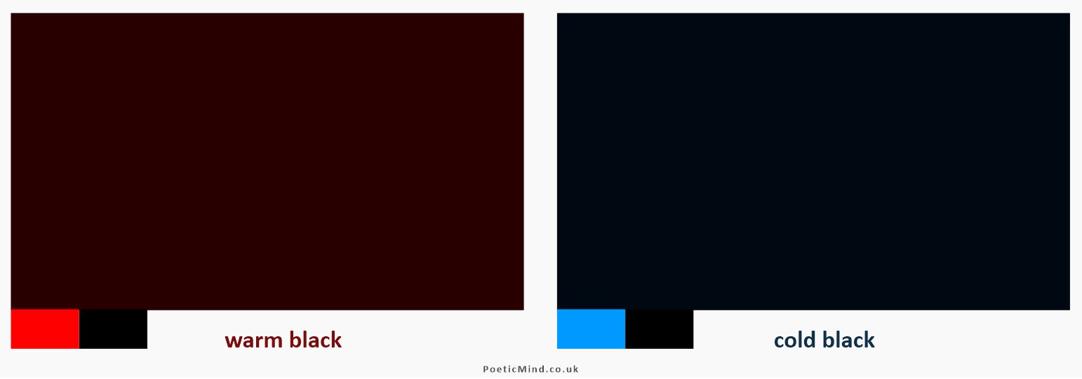
Warm black (left) created by adding red to black. Cold (cool) black on the right, created by adding blue to black.
I have noticed this example in the book The Production Manual: A Graphic Design Handbook (by Gavin Ambrose and Paul Harris), and it has changed the way that I look at life around me…
(A tip for graphic designers: if you need to print black colour, then add red colour to your black, and the black will print much deeper on the paper).
Dr. Gil Dekel teachers on the Open University module U101 Design Thinking.
3 April 2016. © Gil Dekel.
Further reading:
The Production Manual: A Graphic Design Handbook, 2008, by Gavin Ambrose and Paul Harris.
 - Reading with Natalie, book here...