Graphic Designer Alberto Hernández interviewed by Dr. Gil Dekel.
Gil Dekel: How do images and type relate to each other? How do you connect the two?
Alberto Hernández: The relation between images and type is determined by the content and the needs of the project. It might be that a project doesn’t need to have any imagery at all, as it can rely completely on type. And a different project can have images as the main, and sometimes only, device. For me, it is not only that ‘one picture is worth a thousand words’, but that also ‘one word is worth a thousand pictures’ if that word uses the right font, the right colour, the type is well set and, in the case of print work, it’s printed with the right technique, that is, it expresses and reflects the main idea. As Herb Lubalin put it: ‘a well-designed word is worth a thousand pictures’.
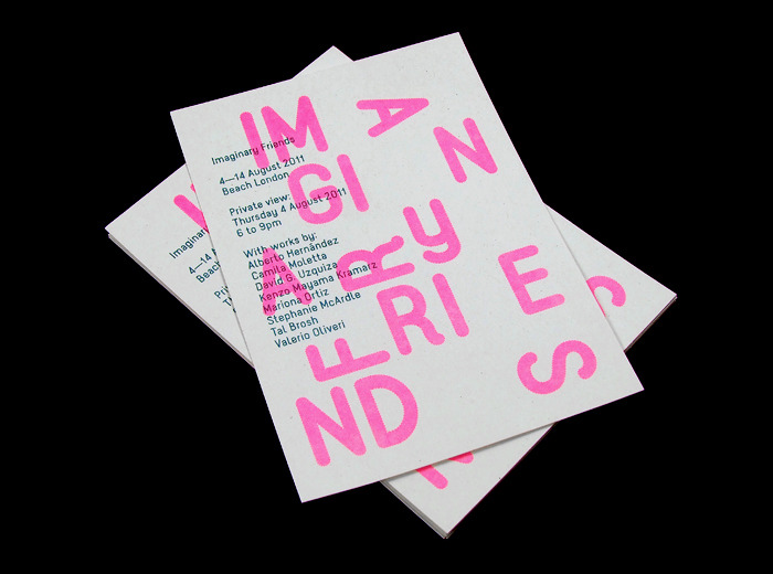
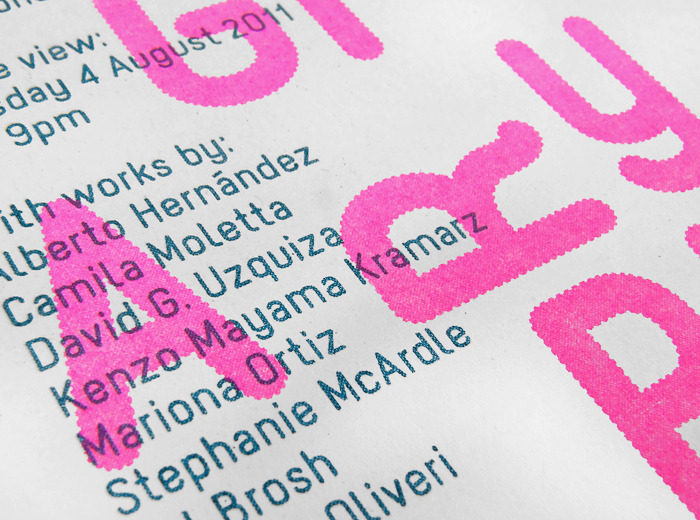
Alberto Hernández – promotional invitation, identity and graphic design for ‘Imaginary Friends’, a group show held at Beach London. Year: 2011. Paper: Cyclus 115gsm. Font: body text: Kiss; title: Kiss (customised and based on children’s toys). Colours: Teal 328 U, and Fluorescent Pink 906 U. Method: Risograph print.
The type is well-set when all the parameters in the word are properly adjusted: the type size, the kerning (space between certain pairs of letters), and the tracking (overall spacing of a group of letters). If there are more than just one word in the design we’d have to adjust a few other things, such as the measure (the length of line), the wordspace, the leading (distance from one baseline to the next, that is, line spacing) and the alignment (justified, centred, or ragged columns).
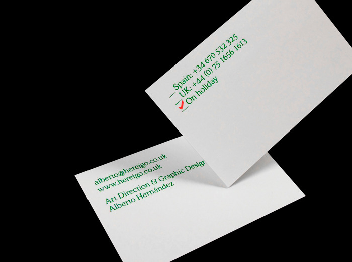
Example of clean typographical design, with attention grabbing in a playful idea of red tick mark indicating where the designer is at the moment (Spain, UK, or on holiday). Alberto Hernández – Self-promotion business card. Year: 2011. Paper: Inuit Tactile Brilliant White 400gsm. Size: 85 x 55mm. Font: Cooper Light (Bitstream). Colours: Green: Kurz Colorit 975, and Red: Ink stamp pad. Method: Foil-blocking and red stamp.
How do you start a new design job/project?
First I read the brief carefully a couple of times. Then I highlight key words that can give me clues to a design solution. I do some research, whether it is in the library, visiting an exhibition or over the internet – I consider research essential part of design – and then I carry on working on any other completely different projects I have under my hands at that moment.
I leave those initial concepts and keywords to develop in my head, and slowly ideas start to come up. Certain studies show that when we are not thinking about something is exactly when ideas start to emerge. I write everything down and use it for brainstorming. After a while (it could be a few hours or even a few days) I look at my notes, rule out what I don’t consider necessary, and start to sketch on paper the ideas that I feel are good. Sometimes I show them to peers to see what they think. I then start working on the computer, and when the project is more or less finished I usually put it aside and come back to it after a while to have another look with fresh eyes.
So in all, it is a process of understanding the brief (what the client wants), highlighting keywords from the brief, conducting a research, starting to generate ideas, sketching them, asking peers’ opinions, designing on the computer, and revising the design.
Where do you draw your inspiration from?
Each project is different, so for each project I draw inspiration from different sources. Inspiration can come from very general things such as architecture, cinema, literature, or it can come from simple minute (and even mundane) things, such as food nutrition labels, which was the inspiration behind one of my recent projects.
I also draw inspiration from European Modernism, but I wouldn’t say my work is totally influenced aesthetically by Modernism but rather theoretically in terms of the clarity, simplicity, decorative restraint, objective presentation of information and functionality.

Anton Stankowski – ‘8. Weltspartag der Sparkassen’, 1978. (Image used by kind permission of the Stankowski Foundation, Stuttgart, Germany. www.stankowski-stiftung.de)
Some prominent Modernists designers are the Swiss Karl Gerstner and Josef Müller-Brockmann (one of the pioneers of the grid system). Other designers that influence me are the British Herbert Spencer and Derek Birdsall; the Germans Anton Stankowski (who beautifully applied abstract geometrical drawings to his work), Jan Tschichold (practitioner of The New Typography whose essence was clarity), and Otl Aicher (whose pictogram system devised for the 1972 Munich Olympics has become a universal standard); and the Dutch Wim Crouwel (whose work for the Stedelijk Museum was impressive).
Another influential designer is A. M. Cassandre (Adolphe Jean-Marie Mouron), an Ukrainian-French painter and designer, who wasn’t strictly speaking a Modernist rather had an Art Deco/Moderne style, but who used powerful geometric forms, planes of colours and letterforms to create bold and simple designs. And lastly, the Bauhaus (1919–1933), the first school for design in the world famous for its approach and which principles, ideals and concepts influenced the International Modernism style thanks to designers such as Herbert Bayer, László Moholy-Nagy and Herbert Matter.
")
Photo of the Bauhaus Building in Dessau, Germany, 2003. Photo published by kind permission of the photographer Mewes. Photo retrieved 19 Sep 2012, from: http://en.wikipedia.org/wiki/File:Bauhaus.JPG
As you can see I draw inspiration from many designers, but if there is some piece of work that I really admire since I started studying graphic design is Herb Lubalin’s (1918–1981) who, in Adrian Shaughnessy’s words, ‘favoured American vernacular styles, Spenserian scripts, and a sort of hybrid modernism’. His expressive typographic layouts have always mesmerized me incredibly. From all his extensive work what I respect the most is three of the magazines he designed: Eros, Fact and Avant Garde, all of them edited by Ralph Ginzburg, being the latter my favourite one. Avant Garde (1968–71) was a magazine on erotic subjects for the general public.
Lubalin’s design and art direction for this magazine is matchless. The layouts are expressive, vivacious, and at the same time refined. The body text was set in the same typeface most of the times whilst the headlines were playful, set in a different one every single article. One of the most interesting things is that Lubalin created cap ligatures, for the first time in graphic design history, for this magazine. Some years after, this bespoke typeface that he created for the masterhead of this magazine, was released as fully functional font called Avant Garde Gothic, one of the most used typefaces in design since its conception.
What about contemporary designers?
There are so many out there whose work I like; amongst those I could name are Akatre (France), Aurèle Sack (Switzerland), Pati Nuñez (Spain), Made Thought (UK), Main Studio (The Netherlands), Onlab (Germany), R2 (Portugal), and Triboro (USA). There are also some big names in the contemporary design scene, who are making new and interesting designs such as Alex Trochut (Spain), Hort (Germany) and Julia (UK).
What is The Publishing Lab project which you run?
The Publishing Lab is a publishing research laboratory studying new ways in which visual communication and literature can work together to create enhanced reading experience when reading books.
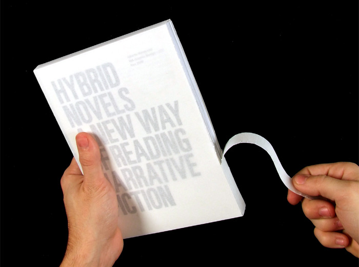
It all started with my MA Major project, developed at the London College of Communication (UAL) in 2009, which I called ‘Hybrid Novels’. The idea came up after a long time of searching through piles of books, particularly novels, where I noted that barely any of them contained imagery. I wondered why this is so. I assume that the older we get the less we are able to ‘read’ images, and that generally people tend to think that images diminish good writing.
I wondered how I could re-design a story of a novel using graphics/visuals in a way that will help the readers get more involved in the reading, and grasp the narrative quicker. How could I enhance the experience of reading? I then designed my first ‘hybrid novel’ in 2009.
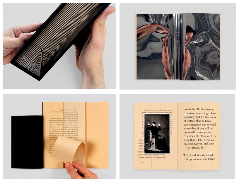
Alberto Hernández – ‘Hybrid Novel’ design for the novel ‘Strange Case of Dr Jekyll and Mr Hyde’ written by Robert Louis Stevenson. Year of your design: 2009. Method: Digitally printed on various stocks (40–250gsm).
A ‘hybrid novel’ has a mixture of images and text. Unlike children’s book or graphic novel, the hybrid text and graphics (illustration, photography, information graphics or typographic treatments) encourage the readers’ actions. By adding playful graphic devices to the original novel, the readers don’t have to just ‘absorb’ dry text, but to ‘play’ with the novel. The novel turns into an artefact – with the playful graphic supporting the narrative, not overshadowing it. It is easier for the reader to follow the plot, while they enjoy the lively design of the book itself. In such way, the authors have not only the words but the body of the book as well. The first ‘hybrid novel’ was designed more than 200 years ago.
When I finished designing my first ‘hybrid novel’, I got in touch with Maria Serrano, who was then editor of étapes magazine in Spain, to try to get it published in their magazine. By chance, she was interested in the same subject, so we teamed up and set up together The Publishing Lab.
This project is crucial these days where we are loosing the tradition of reading physical printed books. The sale of the ‘alternative’ – eBooks – is rapidly increasing, but if we increase the use of visual devices in printed books it will encourage people to read more of them, and have the experience which we cannot feel from reading a digital book.
MA dissertation by Alberto Hernández, which was designed in itself as a ‘hybrid novel’. Year: 2009. Digitally printed on various stocks (100–150gsm), slip case (with spine to be torn off). Size: 142 x 210mm. 124pages.
It is true that eBooks are more convenient and that they allow one to get involved in the story through a multimedia experience (music, interactive design, links to online related sources) but what is different about physical books is the feeling of having one in your hands, the feeling of flipping through the pages and even the sound whilst turning the pages; the feel and smell of the paper and the colours of the illustrations. Writer Maria Fusco puts forward that ‘people want to own a book […] even if the same content can be acceded elsewhere. A book […] builds relevant social ties with its maker, as well as with its reader.’
Is there a correct ‘balance’ between images, type and information (tables)?
It’s impossible to define a correct balance between image, type and tables that can work for every single job, as this depends on the content of each project, the format and the kind of project. In the case of the United Nations Environment Programme report (produced whilst working at Company), the client asked us to design a reference publication on climate change policies. They didn’t supply imagery at all as they couldn’t afford commissioning a photographer, and they didn’t think it was so important… However, we felt it was necessary to introduce the subject with some kind of images so that this heavy texted publication won’t look so dull, but reader-friendly.
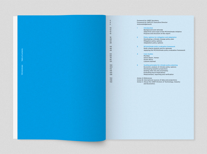
Alberto Hernández / Company – ‘United Nations Environment Programme report’. Year: 2011. Paper: 90gsm. Size: 210 x 297mm. 144 pages. Font: Gotham (Hoefler & Frere-Jones). Colours: Cyan, Cyan-Violet, Violet and Magenta.
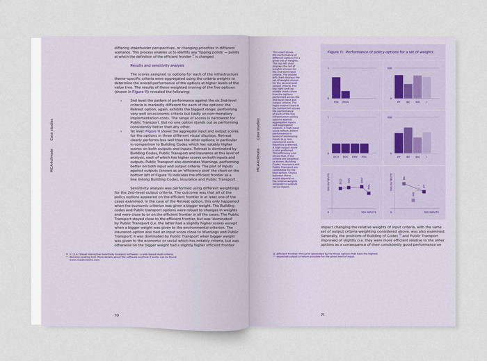
Of course, the most important part was to make the information (texts, diagrams and tables) legible, consistent and visually coherent for the target audience. So we chose the typeface Gotham because it has a comprehensive range of weights, which we needed for such a complex publication with different hierarchies of information. We also felt this font has a sophisticated modern look and a ‘personality’ that suited this annual-report project perfectly.
In terms of the layout, we thought that for such publication which is based heavily on text and data, the page could benefit from ‘breathing’ a bit more by having wide margins, so that the readers won’t ‘drown’ in the page’s information. The chosen colour, cyan, reflects the colour of the UNEP identity but we used pure cyan instead (100% cyan with no other colour added) so that it was consistent with the clarity of the report’s design and it looked more appealing.
The case studies sections were colour coded following the order of the colour wheel, that is: cyan, cyan-violet, violet and magenta.
27 Sep 2012. Updated 8 Oct 2012.
Interview conducted via email correspondences, 14 Sep 2012 – 25 Sep 2012.
Alberto is based in London, UK. Gil is based in Southampton, UK.
© Alberto Hernández and Gil Dekel. Images © Alberto Hernández or as specified.
Exclusive publishing rights © Gil Dekel.
 - Reading with Natalie, book here...